

What is vibrance vs saturation?
If you’ve done any sort of editing on your photographs, whether it be via Photoshop or even a basic phone editor, you’ve likely encountered the terms “vibrance” and “saturation.

These two photography terms may seem to mean the same thing, but they are, in fact, very different- and understanding what each means is important for editing pictures effectively.
What is Saturation in
Photography?
The term ‘saturation’ generally describes the level at which something is absorbed. For example, a sponge is heavily saturated with water.
In photography, saturation refers to how pure a color is. How red is the red? How blue is the blue? You can imagine color being “absorbed” in the photograph like a sponge, with a higher saturation resulting in a more significant color.
A saturated red will be deep and true, while a
desaturated red will be quite gray and dull.
Cameras and lenses operate on light. On a
technical level, saturation is actually just a description of how intense or
dull the light of a specific frequency or wavelength is coming from a light
source. This is actually why the color
of an object changes as its light source changes, despite the object always
having the same color.
What is Vibrance in Photography?
When something is vibrant, that means that
something is bright and striking. Although vibrance is a real word (as any
dictionary can attest)- in regards to photography, vibrance doesn’t actually
exist!
Wait, what? How can vibrance not be real?
It’s true. Vibrance is not a real concept in
photography. Vibrance was actually invented by the company Adobe, the
masterminds behind the industry-standard editing programs Photoshop and
Lightroom.
Saturation can be determined through mathematical formulas and science because it is an actual property of light, but vibrance can’t really be measured. However, Adobe created the term vibrance to distinguish between the two sliders the company developed, the Saturation slider and the Vibrance slider.
When thinking about programs from a computer vantage point, there needed to be a way to increase the saturation of a color without changing the color itself. From Adobe’s own description:
“Vibrance adjusts the saturation so that clipping is minimized as colors approach full saturation. This adjustment increases the saturation of less-saturated colors more than the colors that are already saturated. Vibrance also prevents skin tones from becoming oversaturated”.
Adobe
In a way that can be understood easily,
vibrance is a type of ‘smart’ saturation that adjusts colors differently from
the traditional saturation slider. Vibrance adjusts the more muted colors
rather than intensifying the already saturated colors.
To conclude these definitions, saturation in
photo editing adjusts all of the pixels in a photograph while vibrance only
adjusts the muted pixels in a photograph. Pixels are the tiny little squares or
dots of color (picture elements) that when put together make a complete
picture.
The Importance of Vibrance vs Saturation and Colors
Color theory is a very interesting and significant concept in photography. Color theory refers to how color affects the psychology of people. Each color has the capacity to bring out a specific response from whoever looks at that color. For example, bright red tends to be an exciting color while light blue is calming.
The colors you use for your photography will impact how a viewer interprets your work. If you make the colors too saturated with a moody picture or lack vibrancy for an exciting picture, your audience won’t be able to understand your photograph because the colors are counterintuitive to the subject matter.
Related: Using Advanced Masks in Lightroom
Being able to properly gauge how to use
vibrance vs saturation in your editing process can make or break your
photography career.
The basic guidelines you can hold on to are
these:
Images of subject matter that is supposed to
incite happiness, positive empathy, or energy should be fairly saturated and
vibrant.
Images of subjects that are supposed to be
moody, sad, heartbreaking empathy, or peaceful are less saturated and less
vibrant.
3 Levels to Control Saturation in
Your Photos
There are three key ways to control the saturation in your photographs: the saturation slider, vibrance slider, and HSL Panel.
Although Adobe pioneered saturation, HSL panels, and vibrance sliders, these tend to be prevalent in other editing programs too. So the following information on three different methods of controlling saturation is not exclusive to Photoshop or Lightroom.
1. Saturation Slider
The saturation slider affects all of the colors in an image evenly until they are pure in tone. If you even tap the saturation slider a little bit you’ll notice how quickly colors can intensify. Moderation is key here! Pulling to the left makes colors more gray, pulling to the right brings them closer to their most true color.
Related: How to Retoche Portraits in Lightroom
Saturation slides are excellent for still life photographs and landscapes, as there is less likelihood that adjusting all of the colors at the same time, in the same way, will make an image look too artificial. For images that involve people or natural colors, saturation can very quickly make skin tone look clown-ish.
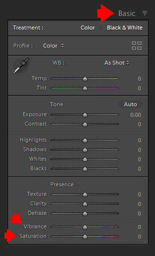
2. Vibrance Slider
The vibrance slider, as mentioned before, only tends to intensify the muted colors in a photograph. It takes a lot longer for the vibrance slider to make an image look too phony or garish. I always start with the vibrance slider to at least even the intensity of colors out before making saturation adjustments. Much like saturation, pulling to the left lowers the vibrancy and pulling to the right increases the vibrancy.
3. HSL Panel – Selective Saturation
HSL stands for “Hue, Saturation, and Luminance” and is a panel box in Adobe Lightroom (with similar panels in other programs). I like to say that this is the panel that adjusts each of the colors individually. Each slider is divided by colors: red, orange, yellow, green, aqua, blue, purple, and magenta.
The Hue is the shade of a color on a gradient. In technical terms, the hue is the wavelength of the light reflected. This describes why an object that is one solid color can change its color dependent on the light or the amount of light that hits it. On the HSL panel, the hue can change how specific colors look. For example, the reds can be made to be more orange in color or more red.

Saturation on the HSL panel determines how intense a color is. Pulling the slider to the left makes the color more gray; pulling the slider to the right makes it more true.
Check my Lightroom Workflow Tip #3 – How to Use Selective Saturation
Luminance lightens or darkens a specific color. Luminance refers to the reflective brightness of colors. I use this slider a lot to make certain colors darker. The most common use of Luminance sliders is to make blue color of the sky darker.
How Do You Determine Whether to
Use Saturation or Vibrance?
If you need to do a really quick edit, you can
quickly determine whether saturation or vibrance is best for your image.
If all of the colors in the photograph are
quite even in their intensity (or lack thereof), then saturation is best.
If you have colors or tones in an image that are all different intensities OR would look wrong if enhanced too much, vibrance is the way to go. Usually, you would use the two sliders in unison, though, as you may find that you want the intensity of the bright colors lowered a bit while bringing up the vibrancy of the less intense colors. This can even your whole picture out.
Contrast, Brightness, Highlights, and Shadows All Affect Saturation and Vibrance
Photo editing has more sliders and adjustments
than just saturation and vibrance. You have contrast, brightness, and sliders
that control the lightness or darkness of shadows and highlights.
When you edit photographs, every change is an
individual variable that affects the rest of the variables. For example, if you
lower your color saturation or vibrance and then increase the contrast, you’ll
notice that the colors become vibrant and intense again. Likewise, if you
increase saturation or vibrance and then darken the image, the colors become
muted again.
Pay attention to how your other edits affect the
colors. I always suggest doing saturation and vibrance adjustments as the last
step for this very purpose.
Saturation vs Vibrance | Final Thoughts
In conclusion, the use of saturation in photography is very important. How you use it is at your own discretion, but luckily photo editing software made this control a bit easier for you by dividing color intensity adjustments into saturation and vibrance!