Are you struggling to understand the rules of composition in photography? Do you want to transform your landscape photography, but you’re just not sure how?
You’re not alone. Composition is the most complex part of photography to learn, and it can take years to master. Fortunately, there are a few simple compositional rules that can take your landscape photos to the next level, fast.
In this article, I will share with you 12 easy rules of composition. These rules aren’t difficult to implement, and so you should have no trouble applying them to your own photography – you just have to be open to experimenting with the rules and open to breaking them when necessary.
Note that some of these rules apply to most forms of photography, but some apply only to landscape shooting. Keep that in mind if you like to photograph multiple genres!
So if you’re ready to improve your landscape photos with some simple composition rules, let’s get started!
The Rules of Composition in Photography
Here are the 12 rules of composition every landscape photographer should know, starting with:
1. The Rule of Thirds
The rule of thirds refers to a fundamental compositional guideline:
Posiiton the key elements of your photos approximately a third of the way into the frame.
That way, you’ll end up with a photo that’s well-balanced and dynamic.
The rule of thirds is famous, partially because it really does do a good job. By positioning your main subject, as well as other important parts of your photo, a third of the way into the frame, you’ll often get a very pleasing result:
Note that the rule of thirds comes with a simple set of gridlines. You can use these to guide yourself when creating compositions in the field.
(In fact, most cameras allow you to use a rule of thirds overlay when looking through your viewfinder, so you can literally have the rule of thirds before your eyes at all times! Convenient, right?)
In landscape photography, the rule of thirds is a great way to get started with composition. Begin by identifying the key portions of your scene, such as a mountain, a tree, a river, or a horizon line.
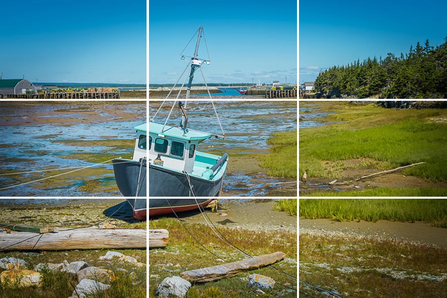
Then try to position those elements along the rule of thirds gridlines. For instance, you might put the horizon on the bottom third gridline, while you could position a tree at the right or left third.
The results will often be stunning.
2. The Golden Ratio
The Golden Ratio refers to a ratio often found in nature:
1.618, also known as Phi.
In fact, the Golden Ratio appears so frequently in nature that it’s a little spooky!
But how does this apply to photography?
In two simple ways.
First, the Golden Ratio can be used to create a spiral, also known as the Golden Spiral. It looks like this:
And by positioning your main subject at the center of the spiral, and allowing lines to radiate outward, you can end up with a beautiful, dynamic composition:
The Golden Ratio can also be used to a create the Phi Grid, which looks like this:
You might be thinking:
Isn’t that just the rule of thirds grid?
Not quite.
You see, the rule of thirds grid divides up the frame equally into thirds. Whereas the Phi Grid clusters the gridlines toward the center of the image for a slightly different result.
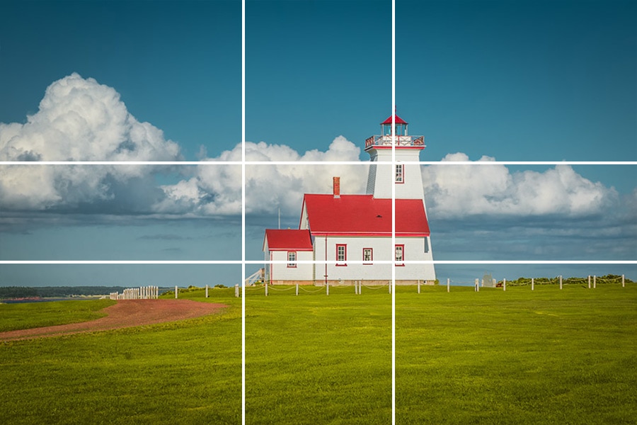
Many photographers argue that the Phi Grid is superior to the rule of thirds, and you can think about it that way if you like. You might also think of the Phi Grid and the rule of thirds as different compositional tools in your toolbox–both of which can work, depending on the situation.
3. Leading Lines
Leading lines are a landscape photography classic.
They’re a simple composition tool you can find in plenty of award-winning landscape shots, because they really are that powerful.
See also: Repetition in Photography Composition
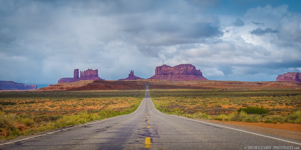
Specifically, leading lines refer to lines that lead the eye through the frame. In general, leading lines bring the viewer into the photo and guide them toward the main subject.
For instance, a river might guide the eye from the foreground, through the frame, and ultimately toward a mountain in the background. In such a case, the river would be a leading line.
(Rivers are very common leading lines in landscape photography, as are fallen logs, lines in the sand, and rocks.)
But leading lines don’t have to start in the foreground and end in the background. They can start at the side of the frame and draw a horizontal line, or they can start at a corner and draw a diagonal line.
To use leading lines in your landscape photos, simply look for any objects that might draw the eye forward (these should be in the rough shape of a line!).
Then place them in your composition so that they point toward your main subject!
4. Aspect Ratio
Aspect ratio refers to the ratio of the width of an image to its height.
Now, the aspect ratio is initially determined by your camera’s sensor–though you can always change the aspect ratio later, during post-processing.
You may be wondering:
Why does aspect ratio matter for composition?
But the truth is that aspect ratio is vital to your landscape compositions. By choosing wider aspect ratios (such as a 16:9 aspect ratio), you can emphasize wider scenes. Whereas a square aspect ratio keeps everything tightly packed and balanced.
In other words:
Your aspect ratio determines how the frame interacts with the scene as a whole.
So choose your aspect ratio carefully! A too-square aspect ratio can show too little, whereas a too-wide aspect ratio can show too much.
5. Layering: Foreground, Middleground, and Background
Layering is a common landscape photography technique that involves positioning your key photographic elements at intervals throughout the frame.
You position at least one key element in the foreground.
You position at least one key element in the middleground.
And you position at least one key element in the background.
This creates lots of depth in your scene, which is why it can be a highly useful method for creating powerful compositions. And even if you cannot incorporate an element into the foreground, the middleground, and the background, you can at least try to use a two-part layer to add depth.
(For instance, you might incorporate a foreground element and a background element or a middleground element and a background element.)
6. Depth of Field: Depth vs Isolation
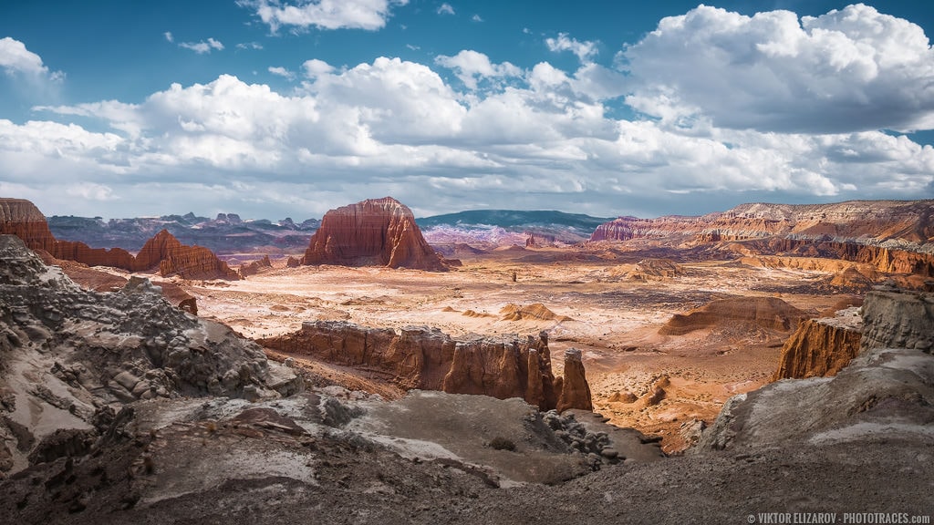
Depth of field refers to the amount of a photo that’s sharp.
So photos with a shallow depth of field only have a small portion sharp.
And photos with a deep depth of field have a large portion sharp.
Both of these options can be used to great compositional effect. However, it’s important to ask yourself:
Do I want to give my scene a sense of depth? If the answer is “Yes,” then you’ll probably want to work with a deep depth of field, which will keep everything in focus and keep the viewer looking throughout the scene.
But if you’d prefer to isolate your main subject, then a shallow depth of field is the better choice. This will blur the background while emphasizing the key part of your image.

7. Perspective
Perspective refers to the position and height of objects in a scene relative to one another.
By changing the perspective, you can make the entire scene look deep–or you can make it look completely flat.
How do you do this?
By getting down low or by moving up high. That’s how you portray different relationships among objects–and get different perspectives.
For instance, a scene photographed from high overhead tends to have very separate, discrete objects, and therefore appears flat.
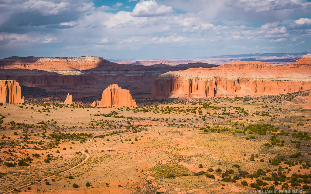
But a scene photographed while lying on the ground tends to have many overlapping elements, giving the illusion of depth.
Make sense?
8. Simplification
Simplicity is a powerful composition tool in landscape photography.
It’s also easy to implement.
Whenever you create a composition, ask yourself:
Do I need everything in this scene? Does it all serve a purpose?
If the answer is “No,” then it’s time to simplify–by eliminating the unnecessary elements. Note that achieving compositional simplicity may involve getting rid of distracting areas along the edges, minimizing distracting colors, and more. It’s all about getting rid of the extraneous parts of your photos, so that you’re only left with what matters.
Simplification can also involve identifying the main points of interest in your scene and making sure there are just one or two areas that draw the eye.
9. Visual Balance
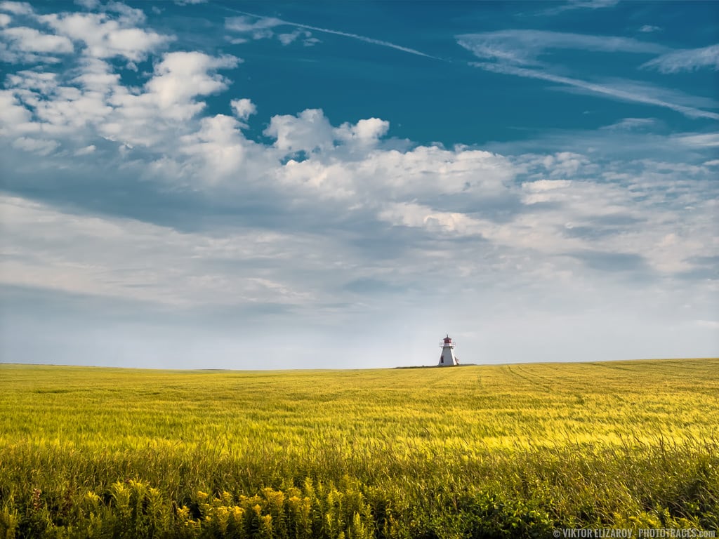
One of the key concepts you must grasp when thinking about composition is that of visual balance.
Generally speaking, you want both halves of your photo to feel equally heavy.
So if you have a large rock on the right side of your photo, you might want several small rocks on the left side of your photo.
This is a complex topic, but balance is somewhat intuitive. Just try to imagine the different elements of your composition with weights.
And see how they balance each other out!
That way, you can get consistently balanced compositions, which is what you want.
10. Framing
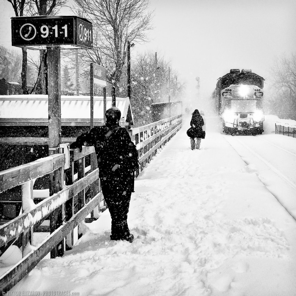
Framing isn’t the most common compositional technique out there, but it can be extremely powerful–and it’s a great way to keep the viewer focused on your main subject.
Start by identifying the focal point of your photo; the area you want to highlight. Once you’ve done this, you have a subject.
Next, look around, and find something that can frame your subject. This can be leaves, tree branches, a window, or anything you can find.
Finally, position the frame around your subject.
The frame will force the viewer’s eye inward, and your subject will instantly be the center of attention.
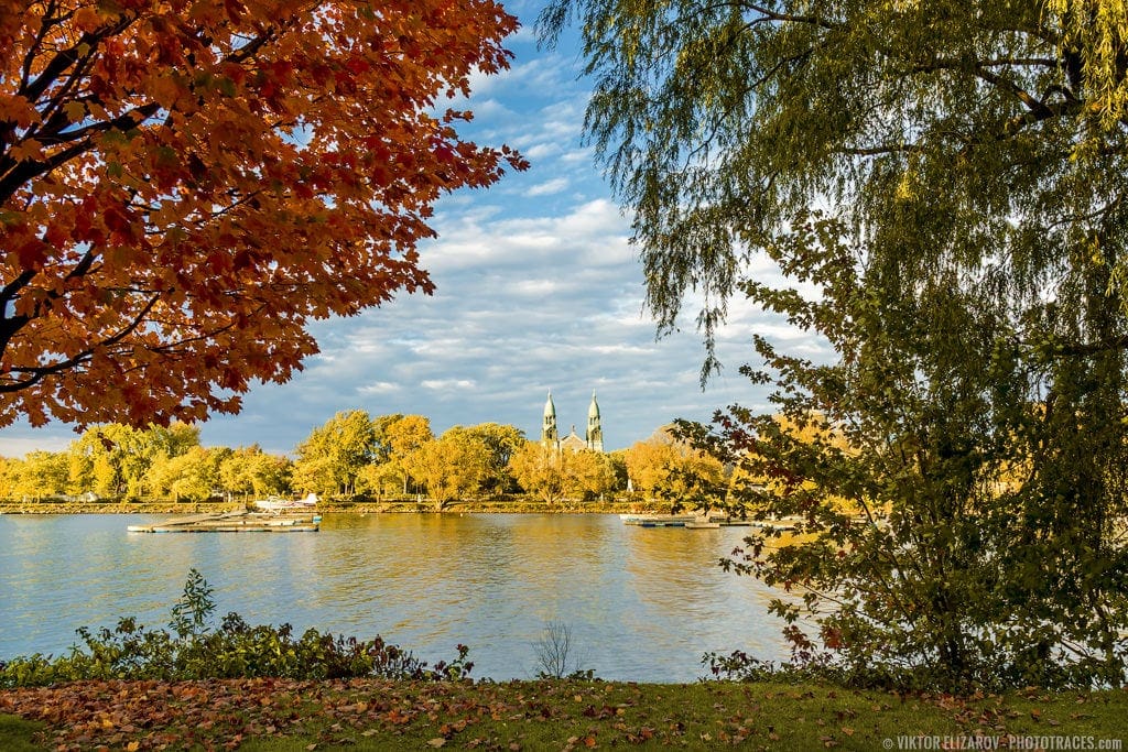
Nice, right?
11. Left to Right
Most cultures read from left to right.
But this doesn’t stop with reading.
You see if you’ve been taught your whole life to read from left to right…
…you actually view things from left to right, as well. Photos included.
So when you see a photo for the first time, you’re likely to start at the left and then move rightward.
Why does this matter?
Because it’s a habit you can use to understand your viewer–and to move them in the direction they already want to go.
Here’s what you do:
Whenever there’s motion in your scene, try to compose so that it travels from left to right.
So if you have a river, capture the flow from left to right.
And if you have a running animal, make sure it’s moving from left to right.
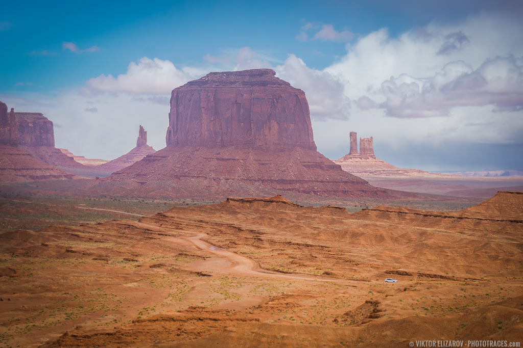
That way, your photo will feel a lot more natural!
(Also, make sure you add some space for your subject to move into–this is a key way to maintain compositional balance!)
12. Break the Rules
If you’re only just getting started with composition, then here’s what you should do:
Start with the rule of thirds. Memorize it. Practice it.
Then move up. Experiment with the Golden Ratio. Try using layers and leading lines.
Finally, once you can confidently work with these various compositional concepts…
…begin to break the rules.
After all, while compositional rules are helpful, they’re really just guidelines.
And by breaking the compositional rules, you can end up with strikingly original images!
Rules of Composition | Conclusion
Creating beautiful compositions might seem hard, but once you’ve memorized these helpful rules of composition, you’ll do just fine.
So get out and start practicing! Some amazing compositions await.

